|
|
 Image via Wikipedia
As you will recall, thanks to an offer from LogoInn, I was able to offer one lucky reader/company a free logo. After accepting entries for about a week, we eventually selected Colfax Main Street as our winner.
We're going to go through the entire process here on the blog, so everyone can learn along. Here's what's happened so far.
- We talked about 5 tips for designing a new logo
- Announced the contest and gave the rules
- Shared a creative brief, with questions you should ask yourself before you start a new logo process
And now, in this next phase…we have Colfax Main Street's answers to the creative brief. You'll notice my commentary in blue. Hang in there, it's long but there's lots of good learning in here.
Logo Inn’s Creative Brief:
Your company name: Colfax Main Street
Describe your business (your product or service): Colfax Main Street is a nonprofit organization that is focused on economic development within the context of historic preservation. We are in the process of applying to become a Main Street Iowa community with the Iowa Department of Economic Development. Here is the link to the Main Street Iowa web site:
http://www.iowalifechanging.com/community/mainstreetiowa/index.html
Website address: We have just purchased domains for Colfax Main Street: COLFAXMAINSTREET.COM, COLFAXMAINSTREET.NET, COLFAXMAINSTREET.ORG. As of today, we do not have our web site up and running. The Colfax Chamber of Commerce has a web site: COLFAXIOWACHAMBER.COM. We also purchased COLFAXIOWA.ORG.
Who’s your target audience: Our target audience is just about anybody – all ages, all demographics. We want to attract people to our downtown, get them to spend time downtown, invest, open a business, shop, or come to events. People who appreciate small town charm and an easygoing lifestyle.
Here's our first sign of potential trouble. No business, organization, product or service can target everyone. If the people at Colfax Main Street don't know what kind of people are drawn to living, shopping or potentially living in a small community in Iowa — they need to narrow that down. Fortunately, there are enough question in the creative brief to help us narrow the focus — at least for the logo.
What colors do you require in the logo? We are open to many color schemes. However, we prefer not to use orange and blue together since that is the local school colors it seems to be overused. Additionally, other towns in the area seem to use a lot of blue. We would prefer not to use blue. We also do not want to use pastels. Many color combinations would work including bold earth tones.
Do you have any preference for you logo regarding image and text style? We are looking for a font that is graceful, classic, possibly scripted, easy to read from a distance, and appears to have a “casual elegance.”
Language you require in logo? Colfax Main Street
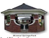
Any additional thoughts? We would like to incorporate our mineral water heritage in our logo, possibly through the use of the Mineral Springs Gazebo.
Okay…potential trouble spot #2. The Gazebo is way too detailed and specific to include in a logo. They might be able to do something with the mineral water idea…but remember, logos do not have to be this literal. Using an architectural element from the gazebo might also be an option. But…we're going for feel rather than literal visuals.
My additional questions:
What, if anything, are you using for a logo now? We are currently using the below logo, Take Pride Where You Reside. This is the name of our committee that is applying for Main Street. Take Pride was a temporary committee that was set up following a Downtown Assessment from the Iowa Department of Economic Development.
If you have a current logo, why are you looking to change it? The current logo is not reflective of the direction we are heading as a group. Take Pride Where You Reside has been used for over a year as we completed various projects in town. Now, we are moving forward combining Take Pride Where You Reside, Colfax Economic Development, Colfax Chamber of Commerce and the Colfax Visioning Committee into one group called Colfax Main Street. Colfax Main Street will follow the Main Street 4 point approach that is used by other Main Street communities across the country.
What word/words need to be included in your logo? Colfax Main Street.
Who is your competition? How are you different from them? Our competition is other Iowa towns, possibly Des Moines, Altoona, and Newton since they are close in proximity. We want people to work in Colfax, shop in Colfax, play in Colfax and live in Colfax. We are different from our competition because we are a small quaint charming town. We are not an urban strip mall community.
What is your brand promise/tagline? How do you bring that to life? An unofficial brand promise/tagline that we are using for Colfax Main Street is a “community partnership.” In the past, Colfax used, “a pleasant blend of town and country.” Since our organization is so new, we have not formalized a brand promise/tagline yet.
What are your organization’s values/mission? Our mission is to bring life to our downtown through historic preservation and economic development. We are a new group with fresh ideas and we want to have fun along the way.
What words would people use to describe your organization/city BEFORE their first visit (in other words-what do they think/believe before they visit)? Small, bedroom community, aging population, rough, dirty, mineral water.
What words would people use to describe your organization/city AFTER their first visit (in other words-what do they think/believe after they visit)? Changing, something is different in Colfax, quaint, surprising, historic, mineral water.
Are there any iconic places, elements of architecture, design elements, landmarks that make Colfax unique? Mineral Springs Gazebo, trees, historic architecture of buildings – bricks, Teen Challenge of the Midlands/Hotel Colfax, Monroe Folding Tables Company, Sale Barn, historic style light posts, Women’s Club Park/Anspach stage is craftsman style.
Which of these words is a better fit for your brand? Techno or Active. Active. Absolutely, not techno!
Which of these words is a better fit for your brand? Warm or Progressive. Progressive.
Which of these words is a better fit for your brand? Old Fashioned or Modern. Old Fashioned. We believe we are a new twist on the old, but not modern.
Which of these words is a better fit for your brand? High End or Cost Effective. Cost Effective. We believe our brand is casual, easy going, but not cheap. We are not aiming to compete with the Jordan Creek Town Center (a high end mall in Des Moines)
Which of these words is a better fit for your brand? Night Life or Early Morning. Both. We have promotional events in the evening, but the town is also busy early in the morning with businesses opening, people having breakfast, children going to school and people having coffee.
Here's an example of potential confusion. When I said night life…I am thinking big city, lots of people on the streets until 1-2 am sort of night life. But the Colfax people interpreted it as having events in the evening. Neither is right or wrong. But you have to be very careful in the language you use to describe elements in the logo design process.
Who would have no interest in your city/brand? People who are against any sort of change. People who are looking for a very urban, high tech experience.
Are there any color no no’s? Image no no’s? If only a two color combination is used, we would prefer not to use orange and blue. Also, we do not want to use pastels.
Competitors' marks. (colors, shapes, concepts, ideas are already being used in the marketplace).
Where will the logo appear/primary usage -how will you use it? The logo will appear on all banners, letterhead, window displays, printed on t-shirts, etc.
Any other production considerations (must work extremely small, or will be usually be reproduced in single color etc.)? It will be reproduced frequently in black and white. It must work very small and very big.
Additional Thoughts from Colfax Main Street:
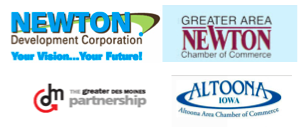
- We would prefer something that is timeless and classic. We want to stay away from the circles used above in the Newtown Development Corporation and Altoona Chamber logo.
- Colfax is famous for mineral water. There were many, many mineral bottling companies in Colfax in the late 1800’s. People traveled from Europe to come Colfax to take in the healing mineral waters. There were many hotels in town for the over two trainfuls of people who arrived daily. There was even a local trolley car to help transport people to the Hotel Colfax.
- Colfax is also the boyhood home of James Norman Hall, author of Mutiny on the Bounty.
- Colfax also has coal mining as part of its history.
There you have it….now we will see what LogoInn comes up with….stay tuned!


![Reblog this post [with Zemanta]](http://img.zemanta.com/reblog_e.png?x-id=24098472-c2a0-49e6-8479-5814d5be0f5e)